
What is the Science Behind the NWS Heat Index Chart?
What is the Science Behind the NWS Heat Index Chart?
In cases involving heat stress, the OSHA Technical Operations Manual suggests that one of the first steps that Compliance Safety and Health Officers (CHSO) should do is to measure, or calculate from available data, the Wet Bulb Globe Temperature to determine potential heat exposure. Unfortunately, in many heat exposure cases involving outdoor workers, the CHSO often relies on the heat index value and the National Weather Service (NWS) chart as evidence that employers have violated the General Duty Clause of the Occupational Safety and Health Act.
Background
Many years ago, the NWS of the U.S. National Oceanic and Atmospheric Administration published this heat index chart.
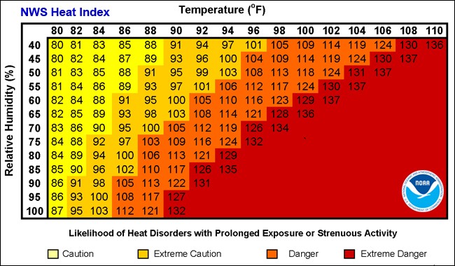
The heat index value was designed to represent the apparent or real feel temperature taking into account both the temperature and humidity. For example, when the temperature is 84 degrees Fahrenheit and the relative humidity is 70 percent, one feels as if the temperature were 90 degrees. The NWS Heat Index chart purports to provide the “Likelihood of Heat Disorders with Prolonged Exposures or Strenuous Activity.”
The chart can be thought of as having two distinct layers of information, each of which was derived from different sources.
The first layer consists of the numbers in the body of the chart which are the Heat Index values in °F and the correlative “Temperature (°F)” values on the horizontal axis and “Relative Humidity (%)” values on the vertical axis. These are the heat index values for each combination of temperature and relative humidity. The numbers in that first layer reflect a scientific paper published in 1979; neither its validity nor that of the first layer of the chart has been questioned.
The second layer of the NWS Heat Index Chart consists of (a) the color-coding in the body of the chart and (b) the legend and words that purport to state the meaning of the color coding. Part (a) of the second layers consists of these colors:
Part (b) of the second layer consists of this legend:
The source of the second layer, both parts (a) and (b), is unknown. Nothing in the literature states its source. Although Rothfusz discusses the NWS Heat Index Chart, it discusses only the first layer (the part derived from Steadman), not its second layer. The second layer of the chart appears to represent the opinion of some unknown person, perhaps within NOAA or NWS, of unknown qualifications.
As mentioned above, OSHA and its lawyers have for years cited the NWS heat index chart as evidence that employers exposed their employees to excessive levels of heat, in violation of the OSH Act’s catch-all provision, the General Duty Clause.
In 2016 and 2017, OSHA issued five such citations to the United States Postal Service (USPS), alleging violations in San Antonia and Houston, Texas; Des Moines, Iowa; Charleston, West Virginia; and Benton, Arkansas. OSHA introduced the NWS heat index chart into the trial record and pointed to it as evidence.
USPS argued, however, that the chart’s second layer should be disregarded as it lacks a scientific basis. (Carnow Conibear represented USPS in this matter.) They argued that the NWS had based the chart’s second layer on a 1981 article in a popular magazine on weather and climate. The article cited, however, no sources for its assertions that certain heat index values indicated caution, extreme caution, danger, and extreme danger. USPS also showed that the co-authors of the article were a meteorologist and a climatologist with no apparent qualifications in human physiology. Carnow Conibear also introduced expert testimony rebutting the idea that the chart had any scientific validity.
In July 2020, Judge Sharon Calhoun of the Occupational Safety and Health Review Commission agreed that “no evidence was presented to establish the scientific basis for the risk categories depicted on the NWS heat index chart.” Despite the prominence of the issue at the hearing, Judge Calhoun found that OSHA had failed to provide any “supporting data … for why the levels of risk [indicated by the chart’s color coding and legend] are attributed to their respective temperatures.”
--
Authored by Rod Harvey, P.E., CIH, CSP, CHMM
Vice President, Client Services